How green was my alley? This map has the answers!
An environmental activist group just launched an interactive map of Greenpoint and Williamsburg’s toxic hot spots that lets residents uncover the dirty secrets beneath their land with the click of a mouse.
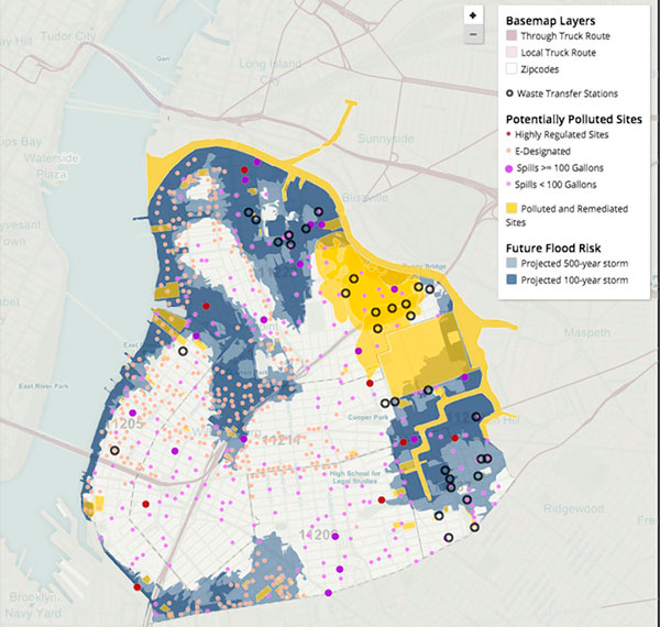
The Greenpoint-Williamsburg ToxiCity Map charts the neighborhoods filthiest features in vibrant colors — a cheery yellow marks contaminated soil, purple dots designate toxic spills, and old factories are blue. Amateur anthropologists can also overlay income levels, asthma rates, and population density to dig deeper into the data.
The map went live on Oct. 20 and is still a prototype, but the creators say they’ve already had plenty of feedback, and locals have told them they want a search bar that allows them to pinpoint their own homes — which they hope to add to future iterations.
“We’re going to take a look and see if we’re able to do that,” said Rita Pasarell of Neighbors Allied for Good Growth, which scored a $50,000 grant from the state’s Department of Environmental Conservation to create the map. “The whole point of the map is for people to be able to use it easily.”
One early user says he’d also like to see the map show more contrast between just-a-little-bit-gross and imminently dangerous forms of pollution, so people living on or near the tainted sites know exactly what they’re in for.
“I think having further distinction of what it means to people that are living or working nearby is useful,” said Willis Elkins of community organization the Newtown Creek Alliance, which works to improve the dirty waterway. “Right now, a lot of it seems mostly uniform, but there’s a lot of variation.”
But environmental champions are still cheering the first round of contamination cartography. Most locals are aware of the filthy state of the Newtown Creek, but many don’t realize all the other nasties lurking in their neighborhood, said Elkins.
“It’s easy for people to not know what is in the soil or the groundwater they’re surrounded by,” he said.
Ideally, the map should actually become less colorful the more successful it is, he said.
“Hopefully this can allow more education and people can use it to advocate for a more thorough and timely clean-up,” said Elkins.
Neighbors Allied for Good Growth expects to have the final map up and running at its website nag.brook