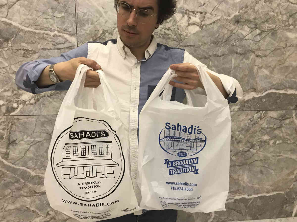
They’re remaking the branding!
The owners of Brooklyn Heights grocer Sahadi’s are stamping a new logo on the shopping bags and packaging for their Middle Eastern delicacies as they prepare to expand their operation beyond Atlantic Avenue to a new outpost in Sunset Park.
“Sometimes you just need a refresh. You see it all the time, different brands upgrade their things,” said Ron Sahadi, who with his sister Christine Sahadi Whelan took over day-to-day operations of the 70-year-old market in 2016. “We didn’t totally go away from who we are and what we do.”
For years, customers toted the shop’s nuts, spices, roasted coffee, and other treats sold in bulk inside containers and bags emblazoned with a royal-blue logo that featured the Sahadi’s name written in a quirky, curved sans-serif typeface above a drawing of the flagship storefront its current co-owners’ grandfather opened in 1948.
But that logo also prominently displayed the original location’s 187 Atlantic Ave. address, and management decided that redesigning the branding to exclude the specific coordinates made sense following the announcement the grocer would set up shop inside Industry City later this year, according to Sahadi.
“We killed the Atlantic Avenue address,” he said.
Sahadi’s new address-free logo also features a drawing of the flagship storefront, but the rendering is far more minimal than its predecessor, and sits below the business’s name written in a clean, serif font.
And the new branding, which the co-owners contracted a graphic designer to create, is black — in large part because management struggled to replicate the former logo’s exact royal-blue hue on all of the store’s packaging, according to Sahadi, who said many loyal patrons approved of the change after he started stocking shelves with materials stamped with the new design over the past several weeks.

“Two people on Saturday randomly told me they love the new logo,” he said. “Everyone seemed to like it.”
Or most everyone, that is, because another loyalist blasted the switcheroo as unnecessary, and out of line with the type of old-school commerce the Sahadi family built its business on.
“Why the need to rebrand everything? Everyone loved the old logo,” said Crown Heights resident Bill Bradley, a self-proclaimed monthly customer of the Atlantic Avenue location. “It represented, to me at least, an old-fashioned way of shopping: interacting with the employees, stocking up on bulk nuts, making orders in various sections throughout the store.”
Other Sahadi’s fans, however, said they don’t care what logo the grocer prints on its plastic bags as long as it continues to offer mouth-watering food and dependable service.
“I seriously did not notice [the logo] — I appreciate the food and the care that I get,” said Brooklyn Heights resident Jarilyn Kaplan.
Those mourning the loss of the royal-blue logo still have time to snag a memento, according to Sahadi, who said his workers will continue to dole out packaging bearing the old branding until it all runs out.
And it’s not first time Sahadi’s patrons lamented an aesthetic change at the store. In 2007, some dedicated shoppers blasted management for trading the grocer’s classic glass jars for generic plastic containers to display its bulk goods — but that swap was only temporary, and the glass vessels have since returned.


